If you are an iOS user for some time, you may at least know the name, Temple Run. It's a very popular game and has been on the top charts for many times. The game is rather simple but addictive. Once you learn how to play, you don't need your brain when you are playing. And now, the developer of this game, Imangi Studios, launches their latest product, Temple Run 2 (and it just hits 1st in the top chart of free app when this blog is posted!).
It still inherits the same playing mode as its predecessor. Simple swipes and tilts and endless run will keep you going. What's changed the most is its map. Previously the map is rather simple, right angle turns and obstacles are obvious, too. The map in Temple Run 2 is much more sophisticated. The path is now curved (which makes you want to swipe left or right) and obstacles can be of very different forms. In all, it is harder to score higher now.
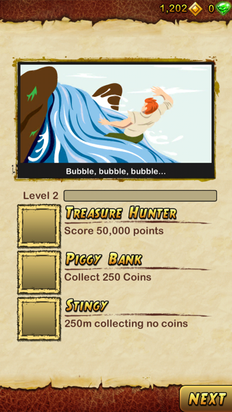
Now you can level up by playing the game and earning coins and the reward could be more coins or unlock some special features or items.
Besides coins, the game now introduces something called gem that you can collect along the way and earn when you upgrade your level. Gems can buy powerups to boost your game scores and revive after you fail. Of course, in-app purchase will make your life easier if you don't want to spend hours to earn the gems.
One thing I don't really like is the whole UI design. To me it looks more like some 1990's computer game rather than an iOS game in 2013. The original Temple Run did a better job in this. Its UI is tidy and well designed and matches the theme very well.
In short, you are likely to continue enjoying yourself in Temple Run 2 if you liked the original version. With some fresh elements in the new games, it could take you some longer time to feel bored. Let's keep running!
Technorati Tags: Game, iOS, Temple Run, Review


0 comments:
Post a Comment