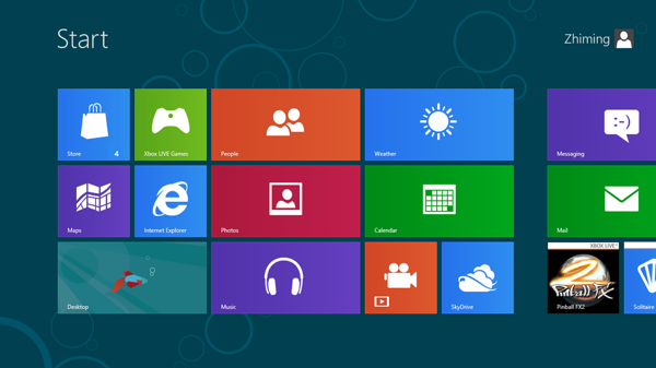
The release of Windows 8 was highly anticipated this year. It is given the mission that it's gonna stand up front and challenge the fast rising iOS and Android, and of course the new era of tablets. However, so far Windows 8 seems not bringing any glory back to Microsoft yet.
I've tried Windows 8 before, not for a long time though. I have to say that Microsoft has put enormous amount of effort in this piece of work. The new UI is fantastic, and not only that, if you click those widgets like weather, news, mails, etc. They are actually put in a very nice layout with rich content. The awkward part is that clearly it is designed for touch interface. Using a mouse to scroll and click just doesn't feel natural.
OK, then here comes Microsoft's remedy: if you are not comfortable with the new UI, yes, we do provide the legacy desktop UI you have been using for the past many years. By pressing the Windows button, all the nostalgic things come back: start menu, task bar, status bar and recycle bin.. And great, now you'll have an upgraded Windows 7.
Actually both UIs are great, the Metro UI and the old desktop version. The question baffling me is that why Microsoft wants to stitch these two together. They simply don't match, and in fact they are vastly different. One's for touch input and the other is for mouse and keyboard. One is created with an aesthetic and modern sense and the other is inherited from some legacy desktop system 10 years ago. This huge gap between the two UI doesn't provide a smooth and consistent user experience at all.
Interestingly, a few days ago I saw this Windows 8 campaign done by Sony's 11 inch laptop, "enjoy the best of both worlds". I have not yet to try that out so I wouldn't judge on that. However, the idea that combining two worlds is just the same as Microsoft's intention: catering both tablet and desktop users at one single shot. Yes, I agree that it could be done, and it is the future trend that eventually touch screen and desktop should converge into one single piece. However, mechanically stitching them together doesn't do this integration any good.
I guess Microsoft is too eager to get this right in the first place but ignored the fact that it still takes many steps and time to change user habit and move towards a unified world of desktops and tablets. They could have separated this into two systems: one for mobile and the other for desktop. Of course, the design element and workflow could be made in a consistent way so that maybe in the next generation, user experience can be smoother and more consistent.
We still need to wait and see how Windows 8 is performing in the market, and hopefully, it won't be another Windows Vista that has failed many's expectations and short lived.
Technorati Tags: Commentary, News, Microsoft, Winodows


0 comments:
Post a Comment