Pages

Showing posts with label Review. Show all posts

Sunday, March 16, 2014

Electronic View Finder FDAEV1MK - The Must-Have Accessory for Your Sony RX1/RX1R

I have owned my RX1 for more than a year and I have been enjoying its superb image quality and portable size. However, I still somewhat miss my old days of DSLR while I could the camera near my eye and frame the picture in the view finder. It is not just about the professional feeling (well, it certainly helps me feel better!), it also helps stablize the camera and view the framing in direct sunlight. 

Sony has provided RX1 two options for view finder, first is the Zeiss optical view finder and the other is its electronic view finder. Zeiss view finder is nothing but a piece of glass with no other information supplied, and it’s priced at such a high premium (SGD 800+!!!). People with some sanity would choose the latter one. The electronic view finder, called FDAEV1MK, is so much more powerful and cheaper as well.

Well, when I say cheaper, it is not that cheap if you look at the absolute value (that’s probably true to most of Sony accessories..). But let’s admit that’s the only option I have for RX1. In Singapore, it’s priced at SGD 629. You are able to get a good point-n-shoot camera with that much of money. So I ordered this overseas from Amazon Japan and got my friend to bring it back. Thanks to the weaker yen and Japanese domestic pricing, I only spent about 400 SGD on this view finder, which is indeed a good deal.

Ok, let’s first start with the usual unboxing..

  DSC00300

The package comes with the viewfinder itself, a smaller eyecup for change, a leather case and a piece of wiping cloth.

DSC00301

A close up of the view finder.

DSC00306

Made in Japan.

DSC00308

The viewfinder with the smaller eyecup on.

2014 02 26 22 26 55

The view finder and RX1! Looks really cool.

2014 02 26 22 31 52 1

And of course it can be adjusted to different angles, up till 90 degrees, and suits different shooting situations.  

2014 02 26 22 32 46 1

This is what you see through the viewfinder. It displays the same information you could see from the panel screen. You can even switch to settings, playback pictures, etc.

In the camera settings, you can set the viewfinder as auto on/off. So when your eyes are close enough, it automatically switches on the view finder and turns off when eyes are away. That’s very convenient for shooting and viewing. 

I’ve tried both eyecups and personally I feel the bigger eyecup suits me better. My nose touches the screen if I’m using the smaller eyecup which caused some discomfort. It’s probably better for people wearing glasses. 

So here is my conclusion of this electronic view finder:

1. It’s very well made and the image is bright, sharp and clear, the lag is very minimal.

2. It helps shooting and viewing under direct sunlight and it greatly reduces the shake when pressing the shutter.

3. The only drawback I found: there is no lock for the viewfinder. So I always have the worry that it will come off if I’m walking and it’s hanging around my body. But frankly speaking, the port is pretty tight and I don’t think it will come off that easily.

Thanks for the reading and enjoy your weekend!

Technorati Tags: , , ,

Wednesday, June 12, 2013

iOS 7 Is Here! My Reviews and Thoughts

Finally the highly anticipated WWDC has shown the world some interesting work Apple is working on. Besides the updated all the small updates, the most prominent one is, without doubt, the introduction of the latest iOS, iOS 7. 

DSC07719

Ever since Jony Ivy has taken over the supervision of iOS design, it has been rumoured that this Apple's ultimate design master is going to redesign the UI completely. Indeed, this time, iOS 7 is a major design overhaul since it's first introduction in 2007. I have downloaded a beta version on my iPhone 5 and I am gonna take you to a closer look at the new iOS. 

DSC07717

Installing the iOS 7 on my iPhone 5.. Even the Apple logo is flattened now.

2013 06 12 20 37 51

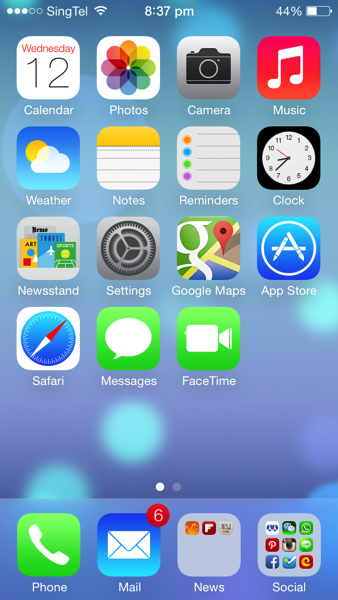
As you can see, except that the layout still remains the same, the rest of the UI looks quite different now. Icons are now flat and more abstract. Colour scheme is lighter. The fonts are thinner. Signal bar is replaced by signal dots. And finally the Clock app is showing the actual time on its icon!

There are also quite a lot of change in animation. When launching an app, instead of pop out from the centre of the screen, now it's from the app icon itself. There are quite a few more transition animation inside apps as well.

2013 06 12 20 41 49

In iOS 7, instead of swiping to the left to access spotlight search, swiping the screen down from any home page will bring down the spotlight search bar. It is obviously more convenient. As you can see, the appearance of the keyboard has changed as well.

2013 06 12 20 37 46

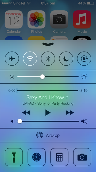
By swiping up from the bottom, it brings up the Control Centre. It is similar to what Android phones have now. Many switches are nicely placed for easy access. Music control is also now integrated in the panel. The flash light can be used as a torch now, although that has already been supported by many 3rd party apps.

2013 06 12 20 42 03

Swiping from the top edge is the notification centre. It has three tabs: today shows weather information, calendar and stock price. All tab has other apps' notifications and missed are those notifications that have not been seen.

2013 06 12 20 37 57

The lock screen is simpler than before. There is no slide bar any more. And instead, it's just a line of words. 

2013 06 12 20 37 59

The passcode pad is also redesigned to circle buttons. 

2013 06 12 20 41 25

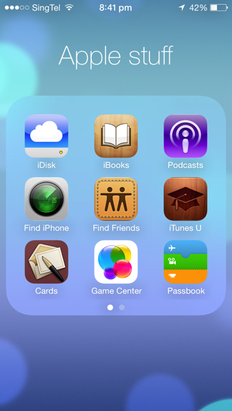
When folder is opened, it now occupies the whole screen and by swiping left and right you can find other apps.

2013 06 12 21 17 16

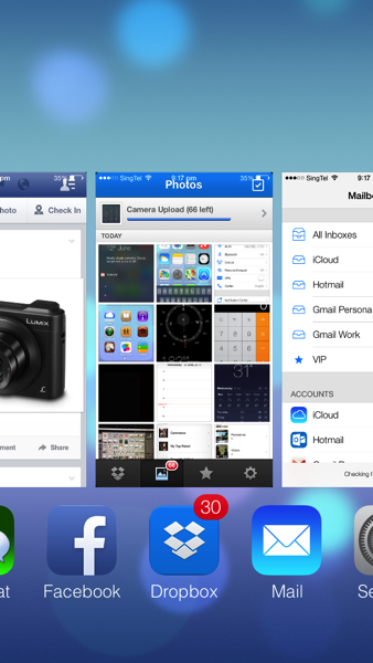
Multitasking UI is changed as well. To close an app in the background, simply drag it upwards. However, it still doesn't have the option to close all at one tap.

2013 06 12 20 40 28

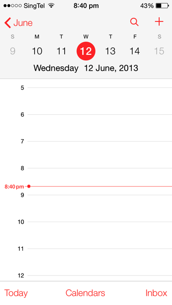
Calendar is redesigned to a flat and simple look as well.

2013 06 12 20 40 22

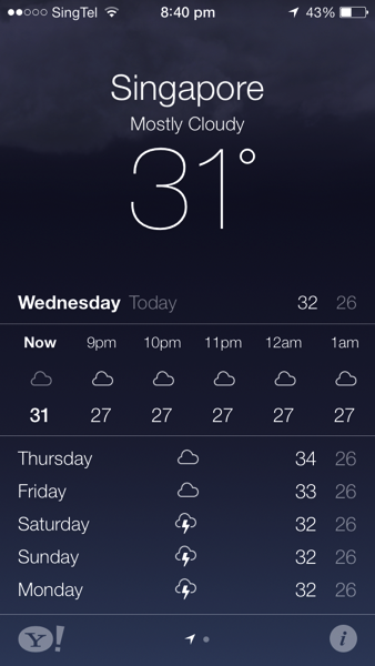
The weather app is more like a Yahoo! weather app now. They are supported by Yahoo! anyway.. But it is quite useless looking at weather forecast in Singapore..

2013 06 12 20 38 212013 06 12 20 38 31

Photo app is now integrated with location and time. If you want to use the old layout, album is the best choice.

2013 06 12 20 40 06

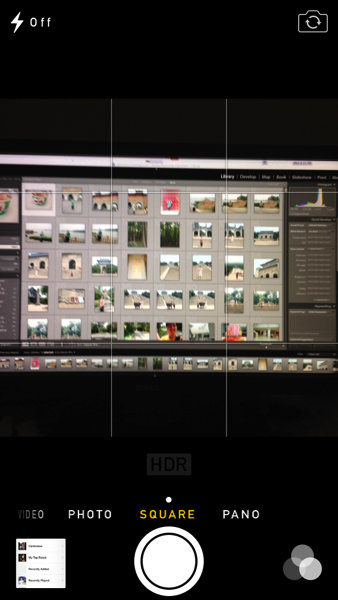
Camera app receives a revamp, too. You can now choose square photo size and also choose one of photo filter provided by Apple. It is more like an Instagram now, though I still love the filters in Instagram more..

2013 06 12 21 37 252013 06 12 21 45 16

Safari now supports more than 8 tabs! The address bar and search bar have finally come to one, which Chrome has done that years ago. The Private Browsing can also be enabled to protect privacy. In the bookmark session, there is one tab called 'Shared Links'. It includes all the shared links through your social network such as Twitter, Sina Weibo etc. Very cool!

2013 06 12 20 41 15

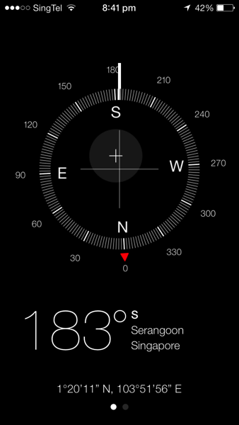
Compass is getting cooler. Now it also shows the location of the current place.

2013 06 12 20 41 39

Settings app is changed to a new look, like on a plain paper.


There are many more small tweaks in the systems and features that I have not covered. In all, I love the new iOS7 a lot. Many people would say that a lot of ideas are copied from Android, like Control Centre. I admit that is the case, but still thinking that if this is something good, why not use it? It shouldn't become that you don't use something good simply because somebody else used it first.

Apple has been criticised that the revamp shows that Apple is lacking in innovation in iOS 7. However, allow me to say, if Apple today has launch some iOS that is only marginally redesigned from previous version, it will only receive more critics on innovation. Complete UI redesign of a mature system isn't a very easy job. Look at Windows 8, you will understand how Microsoft has been struggling with this. It is a bold step for Apple to scrap the old UI and I hope it will get even better in the future.

iOS 7 is not perfectly smooth on iPhone 5. Some apps are crashing more frequently on iPhone 4S. I suppose that the next generation of iPhone has even more computing power. I am also guessing that there is one or two 'killer features' not present on iPhone 5. It may only supported by the new hardware so that the new iPhone differentiate itself from its predecessor. 

Now I am more eager to see the next generation of iPhone equipped with iOS 7! What do you think of the iOS 7? Have you got your hands on it? Let me know your ideas in the comment below! :D 

Technorati Tags: , , , , ,

Sunday, May 5, 2013

HTC One: BlinkFeed, User Interface, Zoe Photo and Many More!

DSC07412

HTC One has created quite some hype on the Internet because it is first of its kind in HTC's smartphone history. All I want to say is, I love the design of this phone! It is as good as iPhone's hardware design, if not superior. In this post, its focus is on the user experience of HTC One. 

Upon launching the phone, the first thing you would notice is the BlinkFeed. If you have used Flipboard board before, you can imagine how it looks like. It can be customized so that the information and updates you want to see will populate on the home screen. It can be news, like straits times or ESPN, apps such as Facebook and Twitter, and even Calendar items in the phone. In short, it's a one-stop information centre on the phone screen.

DSC07440

HTC Sense UI 5.0 is something I'd like to mention as well. Among all the Android UIs I have used, I like HTC's Sense the best. It is simple, clear and easy to navigate around. The settings are intuitive. In the app menu screen, instead of navigating the apps by swiping left or right, it's up and down. However, the screen can't stay at any random position, it is still displaying the apps page by page. 

DSC07441

The task manager screen is a bit different from other Android phones, much like a mini 'mission control' on Mac.

2013 05 05 21 18 26

The font is sharp and layout is clear. 

2013 05 05 21 18 53

The built-in weather app is awesome.

2013 05 05 11 35 19

Even Play Store is customized to HTC style.

Thanks to 2GB RAM and Quad-core 1.7GHz CPU, it is pretty smooth navigating across the screens and very responsive when launching the apps. It supports LTE connection so download speed is not a problem. But I found the Chinese input in HTC One is not very user-friendly and even troublesome. Luckily I can download 3rd party's input from the Play Store.

The sound quality of HTC is impressive, too. With the dual frontal stereo speakers, and built-in beats amplifiers, the phone delivers much richer sound. It is perfect for playing the music or watching movies.

The biggest attraction is HTC One's camera. Unlike the usual marketing campaign, this time the focus is not on the number of megapixels. Interestingly, it's the opposite. HTC One's UltraPixel camera resolution is only 4 megapixel, but the pixel size is as three times as those 13MP phone camera. What does this mean? It means that it captures 300% more light. The largest aperture of 2.0 and built-in optical image stabalization make it more capable in low light situation. 

2013 04 27 23 21 01 1

2013 04 27 12 30 16

2013 04 24 22 25 21

From the sample images above, indeed HTC One does a decent job in low light, however, because of its relative low resolution, image quality and details are somewhat compromised.

However, that is not the best part about HTC One's camera yet. Its best feature is Zoe. It works like as if you were taking a video, but in fact it is just a continuous stream of pictures with 4 second interval. You can stop at any point to choose the best shot it has got. Also, in each event folder, there is a video highlight that puts together all the Zoe and normal photos in one clip of 30 seconds. Some sample videos are below.

It is definitely a lot of fun shooting the Zoe photo/Videos and it makes the gallery more lively! However, one thing I don't like is that the video highlights is only auto-generated based on the photos and videos under the same event. Moving the photos and videos is not so easy that I could not edit on the best videos I have. 

Battery wise, it is more power efficient than my iPhone 5, at least it could last about a day with the Power Saver mode on. However, I notice that charging the phone through USB port powered by my laptop is extremely slow, which is not the case for my iPhone 5. Charging speed seems improving when I used the socket charger, but still it is not something as fast as I'd expect. 

Verdict

HTC One is something I would recommend my family or friends to have because it has unique metallic design, very intuitive user interface, fast performance and a lot of fun elements with its BlinkFee and Zoe photos. The downside is that the built Chinese input isn't that great, the photo quality is compromised due to lower resolution and slow charging speed. If you are now looking for a new Android phone, this is definitely the one you should at least consider. 

Technorati Tags: , , ,

Wednesday, May 1, 2013

Nikon Coolpix A in Action: Photos, Tips and Thoughts

After the previous post, I think everybody more or less knows how Nikon Coolpix A looks like. However, the photo quality is always the top factor to evaluate a camera's capability. In this post, I will share some of my photos taken by the camera and also my experience of using it. 

I have never used a Nikon camera before, be it compact or DSLR. It took me some time to get familiar with the controls and settings, but it isn't too long. Most of them are intuitive. I said MOST is because there are still some quirky settings I don't really appreciate. For example, the dial on the top right is set default as aperture dial. It can change ISO and exposure compensation, as well, by pressing the ISO or exposure compensation button. But I have to hold the button while adjusting the ISO or EV. This eventually makes me have to use two hands to operate the camera.

With the APS-C sensor, Coolpix A undoubtedly has superior image quality compared to a normal compact camera. Most of compact cameras nowadays are able to produce good photos under sunlight. The real challenge is the performance in low light. So noise level at high ISO is crucial. Coolpix A manages the noise pretty well, personally I feel that the maximal working ISO is 3200. 

DSC 0001

This photo was taken in the sunrise, outside my window. F5.6, 1/250s, ISO 110 using scene mode.

DSC 0006

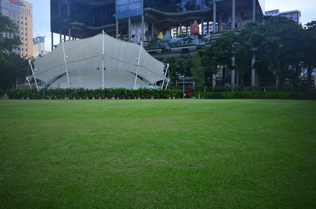
After work, passing by Hong Lim Park. F4, 1/125s ISO 220, using scene mode.

DSC 0019

Boy playing with water at Bugis Junction. F4, 1/640s, ISO 200.

DSC 0033

Black Glutinous Rice at Ah Chew Dessert. F2.8, 1/30s, ISO 1600.

DSC 0042

Kids playing on the beach at Sentosa. F5.6, 1/400s, ISO 100.

DSC 0043

Macro shot of flower. F5.0, 1/30s, ISO 640.

DSC 0007

Chicken wings at Over Easy bar. The actual scene is even darker than the photo. F2.8, 1/15s, ISO 2500

DSC 0014

Close-up shot of apple cider. F2.8, 1/20s ISO 3200.

Verdict

Some of my thoughts on Coolpix A, good and bad.

Good:

1. Small and light, it is one of the few that I am willing to carry on a daily basis. The compact body also makes it easier to snap street photos without drawing too much attention. 

2. High ISO performance is pretty impressive, thanks to its APS-C sized sensor. 

3. 28mm focal length is suitable for various scenarios, so I don't find the fixed length that inconvenient.

4. Battery seems pretty good, around 200 photos per charge. Considering it is small in size and APS-C sensor is definitely more power consuming than the compact camera sensor.

5. Though Coolpix A does not support Wi-Fi and GPS in camera, it's worth mentioning that its accessories can enable it for that. Of course that needs to be purchased separately.

Bad:

1. F2.8 is fast, but not fast enough. In some extreme condition, F2.8 is still too small an aperture, which leads to slow shutter speed and hand-shake.

2. High ISO performance is a bonus point for Nikon Coolpix A. Since F2.8 is not sufficient, I turn to higher ISO. I find it more useful when I set the ISO to AUTO. However, the auto ISO option is not even in ISO setting. I have to go a few levels down and finally find it buried in the camera settings.

3. Image could be sharper, especially at F2.8. There is also some vignetting and loss of details at the corners.

4. Camera lacks built in HDR which may disappoint some users like me.

5. Price tag could be too high. It is even more expensive than some entry level DSLR. Even compared to the same category, such as Fujifilm's X100s, it is around the same price but seems offering more features. However, that depends on individual's needs and preferences.

In all, if you are looking for a compact, low profile camera which can produce excellent images, I would recommend you to take this camera in consideration. It is not much bigger than a smartphone so that you can literally slip it in the pocket.  28mm lens is good for most hangout or walkabout. Impressive high ISO performance makes indoor photo shooting much easier. 

Technorati Tags: , , ,

Monday, April 29, 2013

Pocket-size Camera, Professional Quality: Nikon Coolpix A Hands-On

Camera market in 2013 has been heated by many mirror-less cameras with smaller size yet professional image quality. The combination of APS-C sized sensor and fixed focal length has been popular across different brands: Sigma DP1M, Fujifilm X100s, Ricoh GR, etc. And now it's Nikon's time! Coolpix A is Nikon's latest product that brings APS-C sensor in a compact camera body. It comes with fixed length of 18.5mm (35mm equivalent: 28mm) and its largest aperture is F2.8. In this post, I will have a brief hands-on about how this camera feels.

DSC07419

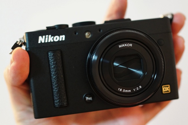
As the name suggests, Coolpix A is in Nikon's Coolpix series, which is designed as a very compact camera body. The black paint is somewhat similar to that on Nikon's DSLR line. It has a special finish with some visible texture. There is a slight curved, leather covered grip at the front to increase the comfort level when people hold the camera. The lens, like many point-and-shoot camera, is covered by the curtain that is controlled by the power switch. There is also an Fn1 button next to the lens.

DSC07018

Compared to Sony RX1, it is shorter and narrower. With less prominent lens size, it is also smaller in depth. It is very light-weighted, 299g, around two smartphones' weight.


 DSC07425

My palm is not big, but I still manage to grab Coolpix A in one hand. It can be easily slotted in a casual outing bag without much effort. People usually will not notice that it is something different from their point-and-shoot camera by just looking at the camera size.

DSC07436

On the back of Coolpix A, the control layout is very much like that on Nikon's DSLR, which is good for previous Nikon's DSLR users. However, I feel that the buttons on the left are somewhat crammed at the edge. Imagine holding the camera in one hand, it is difficult to press the button on the left side, no matter using left or right hand.

DSC07432

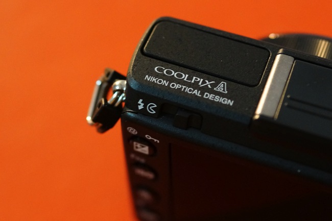
On the top left, it's the Coolpix A print and the flash is hidden in the plate. And this may appeal to some buyers: made in Japan!

So far I feel that Coolpix A is very convenient for carrying around: it can be fit in my suitcase easily and 28mm equivalent focal length is versatile in most cases. I will share more about the shooting experience with Nikon Coolpix A in the next post.  

Technorati Tags: , , ,

Wednesday, April 24, 2013

Love at First Sight: HTC One First Impression

To be honest, I didn't use an HTC smartphone before, except that I played a little bit with my mum's HTC Wildfire (yea, I know..that's from ages ago). While in the Android space, Samsung is taking the lead, HTC is trying its best to stop the declining sales and yes, from this latest flagship: HTC One, I can see that they have put a big bet on it. It is something completely different from HTC's past product line.

Before I saw HTC One, My impression of HTC phones stays at this: plastic phone design, curved corners and big camera right on the back of it. It is difficult to tell what exactly the model is by judging purely on the seemingly identical design. And HTC One just changed all my stereotype. The aluminium unibody build makes the whole design much more tasteful. The white and silver grey are a perfect match and it is suitable for both business and personal.  

DSC07418

The 4.7-inch screen is hidden behind the Corning Gorilla glass. Its resolution is enormous. 1080 x 1920 pixels, which sets the PPI 468. The brightness and sharpness need no further comments. It is just great.

 DSC07409

Below the screen, there are two touch buttons, Back and Home. That is different from Android's common design of three buttons: back, home and settings. I guess the reason that settings button is removed is that most apps now have the setting button inside the app.

DSC07408

On the back of it, it is the camera and this design reminds of the old generations of HTC phones. I am a bit concerned about whether the camera glass will be scratched by the surface when it is facing down. In addition, this camera is one of the biggest selling point in HTC One and it's called Ultrapixel camera. I will have a more detailed review on the camera in the later post.

DSC07407 

Beats audio is still part of the HTC smartphone eco-system. The earphones that come with HTC One is beats branded as well. I have not yet try out the earphone though.

DSC07410

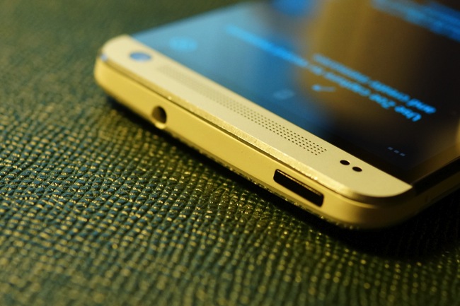
On top of HTC One is the power button and audio jack. You can also see that the cutting at the edge is very beautiful. However, it needs to be taken good care of, otherwise it gets dented pretty easily. HTC One is a bit thicker and heavier than iPhone 5 but doesn't feel bulky at all. But the sleek design of aluminium body is somewhat slippery. It is better to put a case on it in case it slipped out of hand.

In all, I really love the design of HTC One, the aluminium unibody case is way better than any 'advanced' plastic. Yet it doesn't add too much bulk in the pocket. t haven't got much time on exploring its functions. I think I will do that over the weekend. Please check back the blog frequently so you don't miss that!

Technorati Tags: , , ,