Finally the highly anticipated WWDC has shown the world some interesting work Apple is working on. Besides the updated all the small updates, the most prominent one is, without doubt, the introduction of the latest iOS, iOS 7.
Ever since Jony Ivy has taken over the supervision of iOS design, it has been rumoured that this Apple's ultimate design master is going to redesign the UI completely. Indeed, this time, iOS 7 is a major design overhaul since it's first introduction in 2007. I have downloaded a beta version on my iPhone 5 and I am gonna take you to a closer look at the new iOS.
Installing the iOS 7 on my iPhone 5.. Even the Apple logo is flattened now.
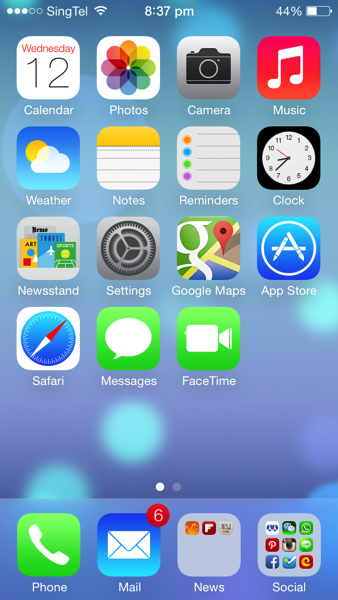
As you can see, except that the layout still remains the same, the rest of the UI looks quite different now. Icons are now flat and more abstract. Colour scheme is lighter. The fonts are thinner. Signal bar is replaced by signal dots. And finally the Clock app is showing the actual time on its icon!
There are also quite a lot of change in animation. When launching an app, instead of pop out from the centre of the screen, now it's from the app icon itself. There are quite a few more transition animation inside apps as well.
In iOS 7, instead of swiping to the left to access spotlight search, swiping the screen down from any home page will bring down the spotlight search bar. It is obviously more convenient. As you can see, the appearance of the keyboard has changed as well.
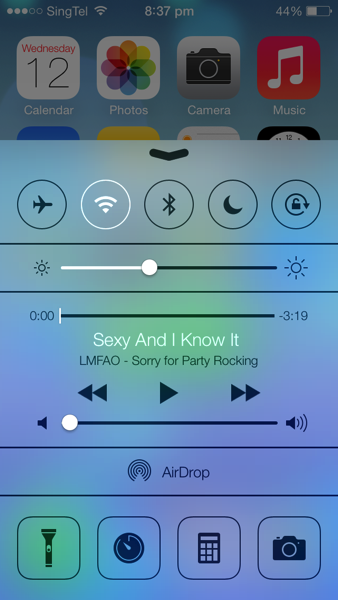
By swiping up from the bottom, it brings up the Control Centre. It is similar to what Android phones have now. Many switches are nicely placed for easy access. Music control is also now integrated in the panel. The flash light can be used as a torch now, although that has already been supported by many 3rd party apps.
Swiping from the top edge is the notification centre. It has three tabs: today shows weather information, calendar and stock price. All tab has other apps' notifications and missed are those notifications that have not been seen.
The lock screen is simpler than before. There is no slide bar any more. And instead, it's just a line of words.
The passcode pad is also redesigned to circle buttons.
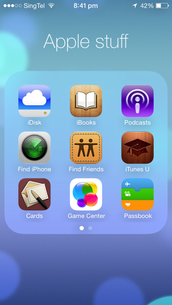
When folder is opened, it now occupies the whole screen and by swiping left and right you can find other apps.
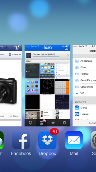
Multitasking UI is changed as well. To close an app in the background, simply drag it upwards. However, it still doesn't have the option to close all at one tap.
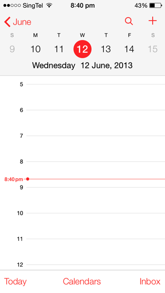
Calendar is redesigned to a flat and simple look as well.
The weather app is more like a Yahoo! weather app now. They are supported by Yahoo! anyway.. But it is quite useless looking at weather forecast in Singapore..
Photo app is now integrated with location and time. If you want to use the old layout, album is the best choice.
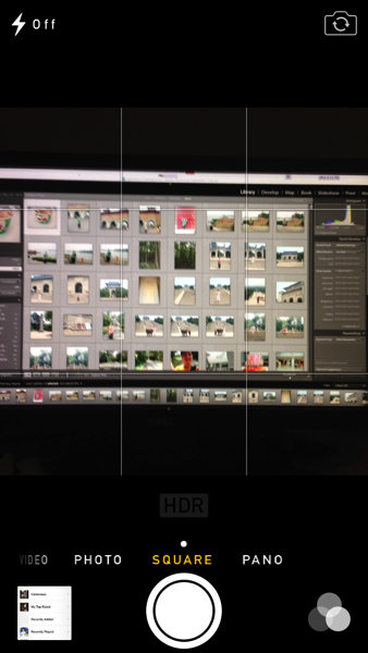
Camera app receives a revamp, too. You can now choose square photo size and also choose one of photo filter provided by Apple. It is more like an Instagram now, though I still love the filters in Instagram more..
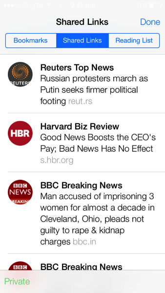
Safari now supports more than 8 tabs! The address bar and search bar have finally come to one, which Chrome has done that years ago. The Private Browsing can also be enabled to protect privacy. In the bookmark session, there is one tab called 'Shared Links'. It includes all the shared links through your social network such as Twitter, Sina Weibo etc. Very cool!
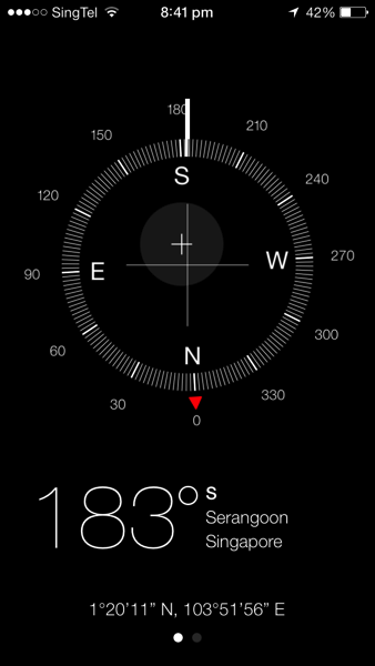
Compass is getting cooler. Now it also shows the location of the current place.
Settings app is changed to a new look, like on a plain paper.
There are many more small tweaks in the systems and features that I have not covered. In all, I love the new iOS7 a lot. Many people would say that a lot of ideas are copied from Android, like Control Centre. I admit that is the case, but still thinking that if this is something good, why not use it? It shouldn't become that you don't use something good simply because somebody else used it first.
Apple has been criticised that the revamp shows that Apple is lacking in innovation in iOS 7. However, allow me to say, if Apple today has launch some iOS that is only marginally redesigned from previous version, it will only receive more critics on innovation. Complete UI redesign of a mature system isn't a very easy job. Look at Windows 8, you will understand how Microsoft has been struggling with this. It is a bold step for Apple to scrap the old UI and I hope it will get even better in the future.
iOS 7 is not perfectly smooth on iPhone 5. Some apps are crashing more frequently on iPhone 4S. I suppose that the next generation of iPhone has even more computing power. I am also guessing that there is one or two 'killer features' not present on iPhone 5. It may only supported by the new hardware so that the new iPhone differentiate itself from its predecessor.
Now I am more eager to see the next generation of iPhone equipped with iOS 7! What do you think of the iOS 7? Have you got your hands on it? Let me know your ideas in the comment below! :D
Technorati Tags: Apple, Hands-on, iOS, iPhone, Review, iOS 7










Not bad...but not very attractive for an iphone that has jailbroken
ReplyDeleteYea. I agree. But jailbreak comes with its price: possible that iPhone becoming brick, not able to update to latest system, unstable iOS, etc.. Why not to have something that is officially supported by Apple ;)
DeleteI would prefer the improvement on Mac OS (Maverick~) is much more incredible compared to the changes happening on IOS 7 (which seems more likes to catch up with others, jailbreak adds-on, windows phone or android etc~)
ReplyDeleteYea, I will be having a hands-on for Mavericks as well, hopefully by the end of this month! I think changes for iOS 7 are somewhat necessary for Apple since the UI has remained the same for many years. Of course, it will never be as 'versatile' as Android which is open source. I think it still got the balance between functionality and user experience.
Delete