Before I got my current iPhone 5, I was using Sony Xperia S, which is the flagship smartphone of Sony by then. The reason I chose it is simple. The design is unique compared to other Android phones, both exterior and interface wise. However, in the end, I am not quite satisfied with the phone as it became really slow after use for a while. The short lasting battery could be another reason I gave up on Xperia S (though iPhone 5 is not much better). Now, the latest Sony Xperia Z is just released and it's an upgrade from Xperia S. Let's see what it has got to offer.
First, Xperia Z comes in even bigger size now. The phone has a 5-inch screen with a massive resolution of 1920*1080 pixels. That brings the pixel density to 441 ppi (pixel per inch), which is even higher than iPhone 5's retina screen, 326 ppi. The display is sharp and bright, and the contrast is high. I have to say, it is a pleasure to look at the Xperia Z's screen.
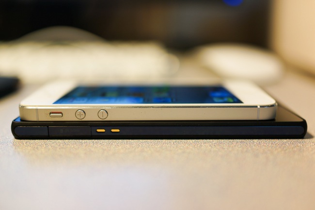
Compared to my iPhone 5, though Xperia Z is much bigger due to the screen size, it is almost as slim as the former (7.9mm vs. 7.6mm).
Xperia Z is beautifully and well built in its exterior design: ports are covered so that they are hardly noticeable in daily use.Front and back are made of glass that is supplied by Corning. It is durable and resistant scratch. However, rather strangely Sony has put another layer of protector above the glasses of front and back. And that piece of protector is NOT scratch resistant, in fact, not at all. I have already seen small scratches on the protector.
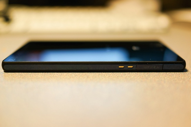
On the left side, there are metal contact point, which is used for connecting the dock accessories, micro SD slot and microUSB port. Xperia Z has an internal storage of 16GB and can be extended up to 32GB through microSD. As I said, the ports are well covered that even I took a while to figure out where the microUSB port is.
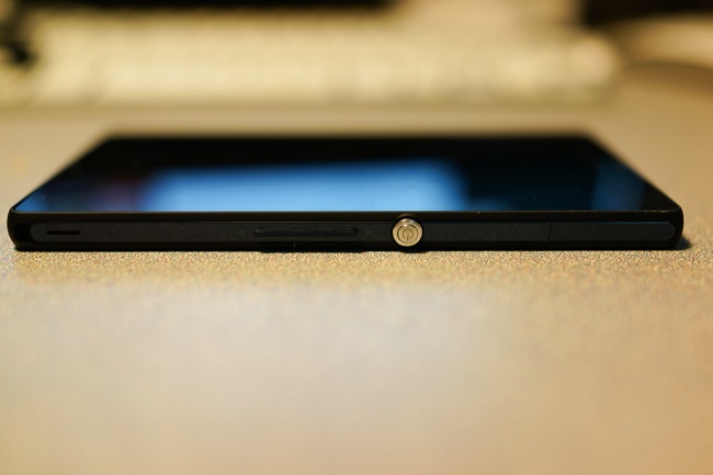
On the right side, there are volume control buttons, power key and the SIM card slot. The power key position is a bit different from Xperia S, and most other smartphones, which is on the top of the phone. However, it is quite comfortable no matter I grip the phone using my left or right hand, as it naturally falls under my index finger or thumb.
On top of the phone, it's the 3.5mm audio jack. I heard that the earphones that come with Xperia Z is good, but I have not tested that out yet.
The camera has been upgraded from 12 megapixel to 13 megapixel. I will have a detailed review on the camera performance in the next post.
Front camera has also been upgraded to 2.2 megapixel. Now it's capable of shooting a 1080p video.
As we have seen that all the external ports of Xperia Z are covered under the phone, it's all because of serving the great feature of dust proof and water resistant. By water resistant, but not water proof I mean, the phone may not be able to go scuba diving or swimming with you, but you can trust that normal splash or a quick dip in the water won't do any damage to Xperia Z. So I did a small test. I put Xperia Z under the water from a water tap, for quite a while. It is still functional, just as advertised.
In summary, Xperia Z has made a step further in its hardware design: it's sleek and slim with water resistant and dust proof feature. The screen is large and such a pleasure to look at. Though the protectors at the front and back are something mysterious, they are neither resistant to scratch nor to finger prints. Other than that, I love Xperia Z and I am just feeling good when I grab it in hand.
Technorati Tags: Review, Smartphone, Sony, Xperia Z


0 comments:
Post a Comment