Many of my friends now own a DSLR or at least a point-and-shoot camera. However, they often are not very satisfied with the picture they took. They complained that the photo is too plain or the landscape is simply not good enough. Actually, with some simple tricks, they can make the photo much more vivid and stunning. Today I'll share with you guys one technique I found most useful when editing my photos, especially for landscape.
↑Here is the before and after using the effect. This photo was taken in Xiamen, China when I visited the seaside at sunset. The photo looks not bad but is a bit too plain and dull. After applying the effect, the photo looks more outstanding with greater contrast, richer colors, and a more classic look, whether you like to call it movie-like or vintage.
Now, let's go through step by step on how to make this. I am using the software Adobe Lightroom to make my life easier. Photoshop could do the same but the settings may not be so easy to find.
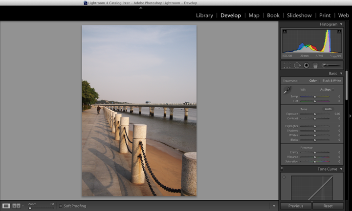
↑First, let's open the image in the Develop module and you shall see the above. The panel on the right side of the photo are the settings which we will adjust later.
↑The photo looks a bit tilted, click the crop button indicated above and rotate it to make it look better.
↑Then under the Tone Curve section, change the point curve from linear contrast to strong contrast, now the picture looks clearer with darker shades and brighter sky.
↑Next, in the Effect section, move the slider to -17, you will notice that the four corners of the photo become darker, the subject in the center of the picture looks more in focus now.
↑Go to the Split Toning, change the highlights hue to 59 and saturation 35, or you can click the small colored rectangle beside the word highlight to adjust the color, anything yellowish is good. Now you notice the whole picture is somewhat yellow. Not nice? Don't worry, it's not done yet.
↑Just below the highlights, change the shadows hue to 223 and saturation to 27, and similarly, you can click the small rectangle to pick the color, anything blueish is good. Now see? The photo is now more pleasing!
↑If you feel that the color isn't rich enough, slide the vibrance bar to +35, you can get a bluer sky!
↑This is the final output. Does this have a warm feeling of sunshine?
The values of settings are just some recommendations and not necessarily to be exact. The bottom line in this trick is to make a larger contrast and color the highlight with yellow and shadow with blue, then you can get a decent result. This technique is suitable for landscape and sometimes good for flowers and plants as well. Below is another example of applying this effect to the picture. The subject flower is more in focus and the color of the leaves is more intense.
Oh if you don't have adobe Lightroom installed on your computer, for your convenience, here is the link to the trial version of Lightroom 4 from the official website, you have 30 days to see whether you want to purchase this. It is Okay if you are using Lightroom 3, the features used here are all there as well.
So, is this useful for you too? Share this with your friends if you like it! Thanks for viewing. Good night!
Technorati Tags: Lightroom, Tutorial, Photography


This is really help!
ReplyDeleteThanks vic! Your photos are great even without the post-processing! :D
DeleteThank u.
ReplyDeleteHope you find it useful! :)
Delete