In my previous post, you got a brief idea of how Lenovo's Yoga 11 looks like. You may notice that I didn't put much focus on what the specifications are, like CPU, RAM, hard disk speed, etc. That's because, to be honest, I don't really care about what's the clock speed of the CPU or the benchmark scores. At the end of the day, all that matters is that whether the system is smooth or sluggish, controls are convenient or awkward and whether it's a breeze or hassle to get your daily things done. Apple does not offer the highest specs in its iPhone and iPad compared to other competitors, but it manages to provide the best experience to its customers. After all, what makes an individual buy the product is that he/she simply likes using it.
In this part 2 of the Yoga 11 review, it will be a mix of Yoga 11 and Windows 8 experience since I haven't really used Windows 8 before and it may also give you a glance of how it looks like. In one of my previous blog posts, I talked about what's the flaw in the Windows 8 design. So in this post, I'll also pay a little more attention to whether the experience is affected in Windows 8.
In case anybody still wants to see what's the specification, here is a screenshot of the system information. More details and specifications about Yoga 11 could be found here. As previously said, Windows RT is running on ARM-based processor, so any existing Windows applications would not be able to run on it. Tegra 3 is something you can find in many Android tablets as well. However, when using Yoga 11, I don't find it dragging down the speed much.
This is the start screen of Windows RT. Very similar to Windows Phone UI, the apps are displayed in various size of 'bricks'. Standard apps like mail, calendar, Windows Store could be accessed easily by clicking on the icons.
Swipe your finger from the right edge, a side bar will slide out. Search function applies to apps, settings or files. It's quite convenient locating anything you are looking for. Share works in many apps like IE, Photos or Videos. The content can be shared through different channels like mail, Evernote or People. On the bottom left is the time, WiFi and Battery icons. Strangely, there is no percentage indicator for battery. If one wants to see that, he has to go to the desktop screen.
Photos app can include not only photos in the system, but also those from Skydrive, devices, Facebook and Flickr.
The weather app is pretty cool. It even has hourly weather forecast and historical weather information.
The built-in news app has a list of sources you can choose from. So you don't have to go to the internet browser to read the news.
Windows Store has featured a number of Apps. Since Windows RT is not compatible with previous Windows applications. Windows Store is actually the only source to install external applications. So far the apps population is still small compared to hundreds of thousand apps in Apple's app store and Android app store, Google Play.
It also has Finance app that can keep investors updated in the financial markets.
And this is something for the sports fans. It features the latest sports news and also the schedule of the matches you may be keen to watch.
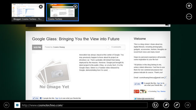
Of course don't forget about Internet Explorer! To my surprise, it's much better than the desktop version. The webpage is loaded pretty fast. Swiping from the top enables the navigation bar to jump between webpages or add/remove pages from IE.
However, if I click the IE icon from desktop screen. The old IE UI comes back. In fact, the two IEs are not the same and they don't even display the same content when you switch from one to another just like they are two different web browsers. This is quite weird and I believe it also creates some confusions among the users.
Yoga 11 is pre-installed with Microsoft Office 2013 RT preview. It is optimised for touch controls and it's definitely the most popular app for your daily work!
This is how Word 2013 looks like. The overall UI is not very different from current Office 2010. you can input characters using the floating keyboard. Press and drag to select the words you want (though it took me quite a while to select the words I want), and then you can editing on them.
In Excel, things are similar too, if you have been using desktop version, you wouldn't find it difficult to get along with the RT version.
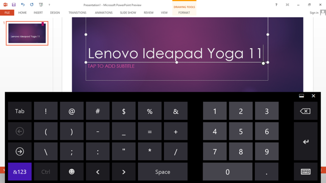
The Powerpoint on a tablet could be essential especially if you just want to edit a little bit before you make a presentation to a client. The workflow, again is just similar to what the desktop version is but more touch input friendly. Just a side note, I like the numeric key layout in Windows 8, it resembles the layout of a physical number keypad, which is very convenient when typing the numbers.
Overall, the Microsoft Office user experience is good. It may not be as easy as a desktop version to create and polish a document and it certainly takes more time to do so. However, it is very nice to have these apps ready on your tablet in case you want to make some small changes or starting a draft on it.
Lenovo says the quoted battery time is 13 hours. Based on my experience, I watched a Youtube video for 45 minutes and played a few music videos and the battery is about 91%. And I also increase the screen brightness for better viewing. I think the battery could last beyond 10 hours easily. If you only use it for browsing web or productivity. The time can be even longer. In short, the battery performance is satisfying and that's is essential for a mobile device.
Windows RT on Yoga 11 is pretty fast and I don't find it sluggish at all in my review period. The trackpad is smooth and responsive but may be a little small for some users. The screen is bright and sharp, a good piece to watch videos and movies.
Also, there are a few drawbacks I have noticed so far:
Specifications of 11 inch and 1.27kg is still too big and heavy for using Yoga 11 as a Windows RT tablet. I would prefer to use my iPad mini for some light reading before bed. In the tablet mode, Yoga 11 is still better when lying on the table.
Windows RT UI is cool, but not as convenient and intuitive. It may take quite some learning time even for the experienced Windows users. One thing I really dislike is toggling between the two screens. I was trying to use merely the new start screen but I found it impossible only using that. For example, if I want to use the Office suite, it will automatically be opened in the desktop screen. In the desktop screen, if I want to access any applications, I have to go to the start screen first and choose the app from there. As I said, Windows 8/RT is fragmented into two piece of work, the old desktop screen and the new start screen. There is clearly space for improvement on this.
To summarize, Lenovo's Yoga 11 is well built and good design to switch between different modes. It is fast and responsive so it's a great piece for both leisure and work. The battery performance is great so you don't have to worry much when you are carrying it around. However, Windows RT may take some time to get used to and it is not in the best size of a tablet form. Office 2013 RT is a great addition to the product which enables you to edit the documents on the go.
In all, If you have intensive demand performance wise, this may not be suitable for you as Tegra 3 may not be keeping up the speed on this. However, if you want to have a Windows 8 tablet, yet you still want some form of the old PCs. This is definitely something you can consider.


0 comments:
Post a Comment