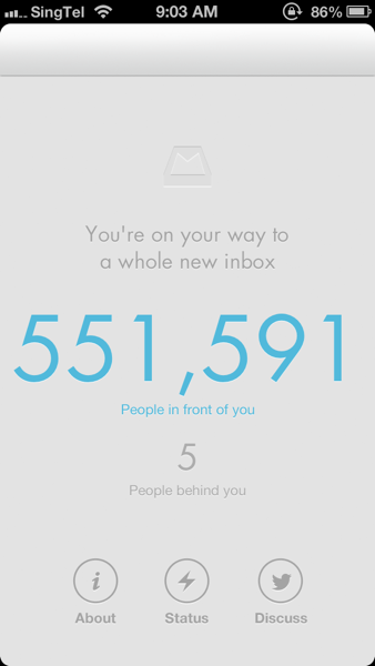
I believe most iPhone users like me are using the built-in Mail app for email messaging. It's convenient and rather intuitive and we can check all the email accounts at one go. Weeks ago, a friend of mine recommended me to try out the Mailbox app. I tried and downloaded the app. It turns out that because of the overwhelming demand, the service provider is struggling to catch up in capacity. They set up a reservation queue to curb the requests. Below is what I've got when I first made a reservation.
550 THOUSAND PEOPLE IN FRONT OF ME! Judging by the clearing speed and it doesn't seem to come to me any soon.
And two weeks later (yes it's right, two whole weeks), I finally got my turn to try out the app!
The app is only working for gmail accounts. Before I entered the user interface, I was wondering what makes it so special that everybody wants to use it in the first place? And I believe built-in app is already sufficient for us.
The ideology of this app is called inbox zero. In short, since we all receive quite a number of emails everyday and they got piled up in the inbox after a while. To keep the email box clean and organised is the goal of inbox zero. Of course, one can always argue the necessity of this because search function is good enough for us to dig any mail in the mass. However, it still helps us in many other ways, like how we do work, manage personal life, etc.
One thing different here is that the badge count at the top right of the app icon is not the number of unread messages, but the number of outstanding conversations in the mailbox. It means that how many things we are working on right now rather than how many are waiting for our attention. That's a very interesting concept.
In the first launch, Mailbox will ask to archive all the currently messages to give a clean start.
Once clicked, the inbox is empty and so we can start getting organised when moving forward!
Mailbox in general provides 4 options when an email arrives at inbox.
1. Swipe right to archive
2. Long swipe right to trash
3. Swipe left to snooze, or call it 'action later'
4. Long swipe left to put in a list
It is a good practice to keep email organised, or rather, keep one's life organised without missing important messages and events.
The entire app UI is well designed and has a modern look. The switch between screens is very smooth as well. Compared to that, Google's native gmail app is disappointing (especially Android version). I seriously suggest Google's app development team to hire some talented UI designer. Geeks don't necessarily have to be cumbersome.
In all, Mailbox is great alternative to Google's Gmail app and it is good to see a mail application is promoting some idea that many people would need: reclaim one's life, time, and more, by starting to get organised in email box first. However, it could still be improved by supporting more email service providers and add more customised functionalities.
Give it a try! You may like it! (it may take you quite a while to queue up though :)


0 comments:
Post a Comment