Pages

Saturday, June 15, 2013

Adobe Lightroom 5 Official Version! Three New Features That You Must Try

Screen Shot 2013 06 15 at 10 38 02 PM

As mentioned in my previous post, I was excited about the new upgrade of Adobe Lightroom. At that time Lightroom 5 is only a beta version so that it is not compatible with the Lightroom 4 catalog file. Now finally Adobe puts its official release on its website. What's more, anybody with an Adobe account can enjoy up to 30 days free trial! So if you are not so sure whether Lightroom 5 is the right tool for you, always download the trial version to find out more!

Over the upgrade, the greatest concern is that whether it offers faster processing speed that Lightroom 4. Lightroom 4 is REALLY sluggish, much slower than Lightroom 3, regardless of your hardware specification. A couple of my friends tried out the Lightroom 5 and said it's much faster than its predecessor. However, I don't have the same experience as them. I find it marginally faster than before. It could be because that I am running it on MacBook Air that I bought almost three years ago (Core 2 Duo!). So I would assume anybody has a current mainstream computer would enjoy the improvement.

Lightroom 5 offers a bunch of new features. Besides some of the small add-ons like video slide show, location-based organisation. There are three features I think are worth introducing in this post. This will greatly enhance the post-process of your photos.

Radial Gradient

First is the radial gradient. Previous generations of Lightroom only offers linear gradient functions. It has been a great function in editing. The addition of radial gradient makes this even more useful. 

Screen Shot 2013 06 15 at 6 27 27 PM

Changing the saturation to negative, it can make the subject stand out

Screen Shot 2013 06 15 at 6 33 42 PM

Adjusting the exposure to negative, the subject in the centre of the radial filter will be standing out (thought that could be achieved using vignette effect).

Upright

The second feature is Upright. Lightroom 5 will auto-analyse the picture and adjust to the upright perspective. It is extremely useful for landscape and building photos since many times we may not have photo at perfect level or vertically it is not in the same plate.  Below are some examples how this function can help solve the problem

Screen Shot 2013 06 13 at 7 47 17 PM

I took this photo around Chinatown, Singapore and you can see that the photo was taken from lower perspective (I am not tall enough! :( ). After the adjustment, the photo looks like as if it were taken from the same level.

Screen Shot 2013 06 14 at 10 42 37 PM

This was taken in front of the Grand Place in Cambodia, I was trying to capture the flying pigeons so I didn't notice my photo is tilted. After the Upright adjustment, it loos much better. It may seem only some rotation is done, but if you take a closer look, you can see the road line is straightened as well. 

Advanced Healing Brush

The last one is powerful! If you have used Photoshop before, you'll be amazed how its healing brush works. It can smartly remove the subject and keep the background clean as if it never existed. And this advanced healing brush has come to Lightroom 5! You are empowered!

Screen Shot 2013 06 15 at 6 43 01 PM

In the photo above it is actually good to have some figure in the foreground, so here is just an illustration of how it works. All you have to do is to apply the healing brush on the subject and it will be replaced by the similar background! Isn't this great? though you may need to try a few times to get the best result.

This is what I have got with Lightroom 5 so far. For sure there are many more to explore and I will share with you guys when I find out that. Also please let me know in the comment if you have tried out Lightroom 5 and found any interesting bits.

Technorati Tags: , , ,

Wednesday, June 12, 2013

iOS 7 Is Here! My Reviews and Thoughts

Finally the highly anticipated WWDC has shown the world some interesting work Apple is working on. Besides the updated all the small updates, the most prominent one is, without doubt, the introduction of the latest iOS, iOS 7. 

DSC07719

Ever since Jony Ivy has taken over the supervision of iOS design, it has been rumoured that this Apple's ultimate design master is going to redesign the UI completely. Indeed, this time, iOS 7 is a major design overhaul since it's first introduction in 2007. I have downloaded a beta version on my iPhone 5 and I am gonna take you to a closer look at the new iOS. 

DSC07717

Installing the iOS 7 on my iPhone 5.. Even the Apple logo is flattened now.

2013 06 12 20 37 51

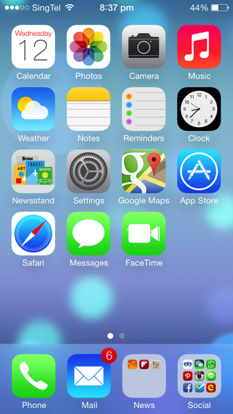
As you can see, except that the layout still remains the same, the rest of the UI looks quite different now. Icons are now flat and more abstract. Colour scheme is lighter. The fonts are thinner. Signal bar is replaced by signal dots. And finally the Clock app is showing the actual time on its icon!

There are also quite a lot of change in animation. When launching an app, instead of pop out from the centre of the screen, now it's from the app icon itself. There are quite a few more transition animation inside apps as well.

2013 06 12 20 41 49

In iOS 7, instead of swiping to the left to access spotlight search, swiping the screen down from any home page will bring down the spotlight search bar. It is obviously more convenient. As you can see, the appearance of the keyboard has changed as well.

2013 06 12 20 37 46

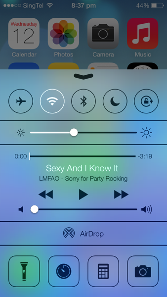
By swiping up from the bottom, it brings up the Control Centre. It is similar to what Android phones have now. Many switches are nicely placed for easy access. Music control is also now integrated in the panel. The flash light can be used as a torch now, although that has already been supported by many 3rd party apps.

2013 06 12 20 42 03

Swiping from the top edge is the notification centre. It has three tabs: today shows weather information, calendar and stock price. All tab has other apps' notifications and missed are those notifications that have not been seen.

2013 06 12 20 37 57

The lock screen is simpler than before. There is no slide bar any more. And instead, it's just a line of words. 

2013 06 12 20 37 59

The passcode pad is also redesigned to circle buttons. 

2013 06 12 20 41 25

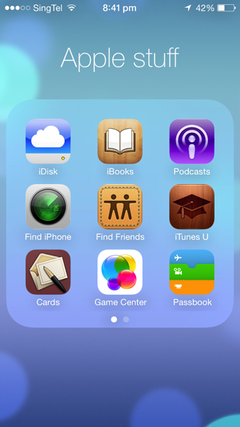
When folder is opened, it now occupies the whole screen and by swiping left and right you can find other apps.

2013 06 12 21 17 16

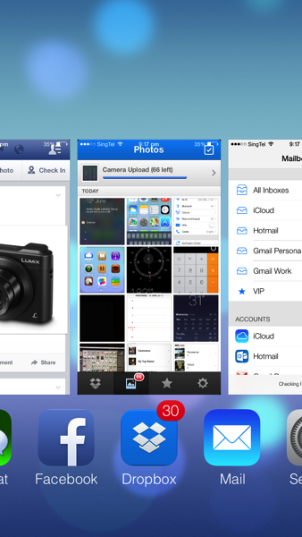
Multitasking UI is changed as well. To close an app in the background, simply drag it upwards. However, it still doesn't have the option to close all at one tap.

2013 06 12 20 40 28

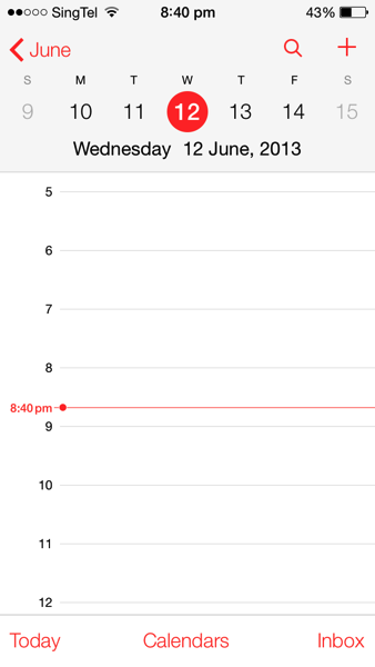
Calendar is redesigned to a flat and simple look as well.

2013 06 12 20 40 22

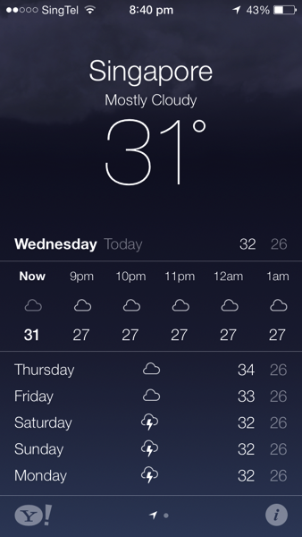
The weather app is more like a Yahoo! weather app now. They are supported by Yahoo! anyway.. But it is quite useless looking at weather forecast in Singapore..

2013 06 12 20 38 212013 06 12 20 38 31

Photo app is now integrated with location and time. If you want to use the old layout, album is the best choice.

2013 06 12 20 40 06

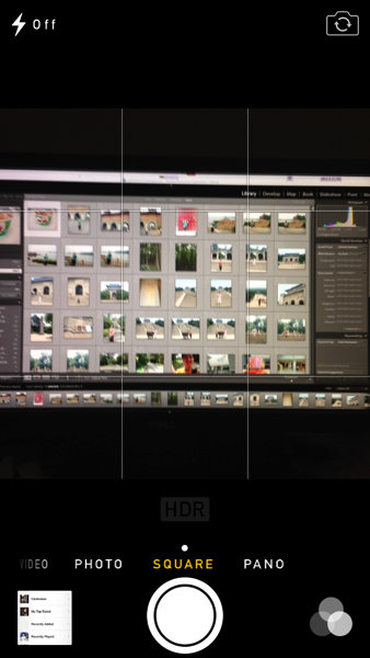
Camera app receives a revamp, too. You can now choose square photo size and also choose one of photo filter provided by Apple. It is more like an Instagram now, though I still love the filters in Instagram more..

2013 06 12 21 37 252013 06 12 21 45 16

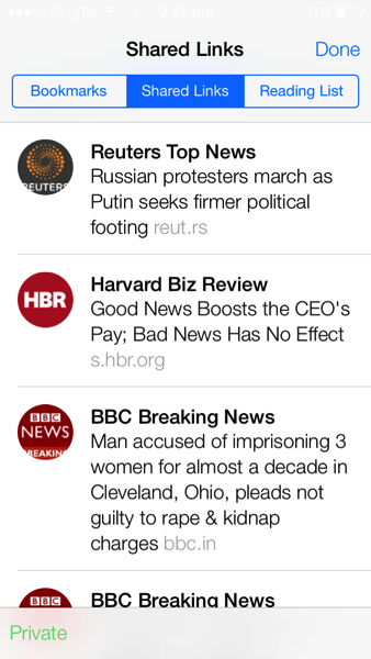
Safari now supports more than 8 tabs! The address bar and search bar have finally come to one, which Chrome has done that years ago. The Private Browsing can also be enabled to protect privacy. In the bookmark session, there is one tab called 'Shared Links'. It includes all the shared links through your social network such as Twitter, Sina Weibo etc. Very cool!

2013 06 12 20 41 15

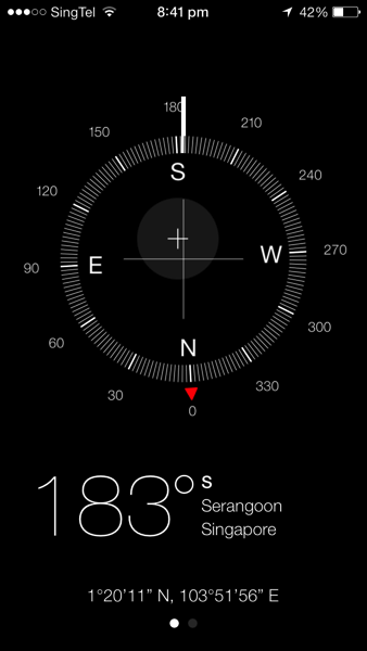
Compass is getting cooler. Now it also shows the location of the current place.

2013 06 12 20 41 39

Settings app is changed to a new look, like on a plain paper.


There are many more small tweaks in the systems and features that I have not covered. In all, I love the new iOS7 a lot. Many people would say that a lot of ideas are copied from Android, like Control Centre. I admit that is the case, but still thinking that if this is something good, why not use it? It shouldn't become that you don't use something good simply because somebody else used it first.

Apple has been criticised that the revamp shows that Apple is lacking in innovation in iOS 7. However, allow me to say, if Apple today has launch some iOS that is only marginally redesigned from previous version, it will only receive more critics on innovation. Complete UI redesign of a mature system isn't a very easy job. Look at Windows 8, you will understand how Microsoft has been struggling with this. It is a bold step for Apple to scrap the old UI and I hope it will get even better in the future.

iOS 7 is not perfectly smooth on iPhone 5. Some apps are crashing more frequently on iPhone 4S. I suppose that the next generation of iPhone has even more computing power. I am also guessing that there is one or two 'killer features' not present on iPhone 5. It may only supported by the new hardware so that the new iPhone differentiate itself from its predecessor. 

Now I am more eager to see the next generation of iPhone equipped with iOS 7! What do you think of the iOS 7? Have you got your hands on it? Let me know your ideas in the comment below! :D 

Technorati Tags: , , , , ,

Monday, June 3, 2013

Do You Have A Cardboard Camera? IKEA KNÄPPA Camera Hands-On

I haven't done any post in the past two weeks because I was busy with exams..Now finally it's time to talk about new things in life! :D

IKEA's latest marketing initiative has demonstrated us that it's not only a furniture company, but a company that advocates a lifestyle. KNÄPPA camera is a product of this ideology. 

I was lucky enough to win a prize when participating in IKEA's marketing campaign. I redeemed this very special camera at their store. 

DSC07650

By the look of it, you can't really tell this is a camera. It is more like a piece of toy that is made of cardboard. On the top left, it's the USB plug that photos can be transferred to a computer. The memory could hold 40 pictures at one time. When it's full, the photos need to be deleted from a computer. And yes, it's reusable. 

DSC07652

The button in front is both a power button and shutter release. Long pressing it will turn on the camera, and it will be off if pressed long again. The green light will stay on if the camera is on. It will also be automatically switched off if no photos are taken within 60 seconds.

DSC07651

You need to unscrew to open the camera. Isn't it similar to IKEA's idea of DIY assembly? Between the two pieces of the cardboard, it's the electronic part of the camera. And it's where the batteries are placed. 

DSC07655

The batteries are placed and the power is on!

I didn't have too much expectation on this camera given its 2 million resolution (that's like phone cameras 10 years ago). So I just took some random pictures when walking in the city. Below are some shots. 

P003

P004

P008

P010

P011

P012

P017

There is no way for this KNÄPPA camera to compare with a professional or even a consumer camera. The pictures are filtered like some oil painting and it's only suitable for being used under sunlight. However, it does bring some fun like a film camera. You never know how the picture turns out to be until you see it. And IKEA has achieved their marketing goal as well. They are more creative than you think!

Technorati Tags: , ,

Wednesday, May 22, 2013

Decorate Your Room with Stars - Star Theatre Planetarium

I believe most of us dreamed of becoming an astronomer in our childhood. When I was young, I was so fascinated by the sky that is full of stars and wondering what is really happening out there. Nowadays we care less about astronomy (what? right, if you count horoscope in). It is also difficult to spot that many stars in urban areas because of light pollutions. Recently I came across this really cool stuff when reading through a magazine. I would really like to share it with you guys, the Star Theatre Planetarium.

P1585 column grid 12

(Photo from Firebox.com)

It works much like a projector. When you turn the lights off in the room, and switch on the Star Theatre, here we go, you have the whole universe in your room! I managed to find a video on youtube to demonstrate the coolness.

It can also be set a time interval to produce random 'shooting stars' so it looks more real!

Isn't it great? Ok, I admit that it's a bit geeky watching stars in your room, but that's a perfect entertainment when you invite friends to your house and also a good opportunity to impress your girlfriend! :p 

Technorati Tags: , ,

Wednesday, May 15, 2013

What to Expect from Apple’s iPhone 6 (or 5S?)

Apple iphone 6 rumors

(Photo credit: International Business Times)

The next generation of iPhone is likely to debut in a few months. The earliest possible date is June 10 - 14 when Apple hosts Worldwide Developers Conference (WWDC). Its actual product sales launch could be sometime in July or even September, considering the previous launch time.

Amid worries about Apple’s slowing growth, iPhone is definitely the key to reassure investors’ confidence. iPhone sales account for more than half of the firm’s revenue and it’s the key driver for Apple’s growth over past 5 years. Every single release of iPhone has been highly anticipated. The coming one is without exception, and it could be even more interesting.

The much heated competition in smartphone space has brought a lot of pressure on Apple’s ability to stay innovative, especially after Jobs’ departure. iPhone 5 is a major redesign from iPhone 4S, however, in terms of its operating system, iOS 6, it is not that ‘surprisingly’ good, not mentioning Apple’s fall in its own developed Maps app.

Personally, I still feel that iPhone 5 is the best phone I have ever used. It does the work and it does not have too many quirks except occasional hiccups. It is difficult for Apple to improve something that is already this good, but they have to. :) Below is just some of my guess what will be appearing in the next generation of iPhone.

Hardware-wise, there should not be much radical redesign. The possible upgrade could be

  1. Faster processor and possibly larger RAM. That is something that is most likely to be going in.
  2. Camera. better lens, or larger sensor and higher resolution.
  3. NFC integrated: that’s one thing missing in iPhone 5, which eventually makes Passbook App useless. Hopefully NFC technology could enable this app again. NFC could be used for contactless payment, identification and data transmission, etc.
  4. Larger battery capacity. iPhone 5 has been blamed for its short-living power performance especially in the use of LTE(4G) network. Longer battery life is always something desired.
  5. 128GB storage option. Since the latest iPad is already offering the option of 128GB internal storage, there is no reason that iPhone would not follow the same.

Compared to hardware, I believe it could be a major revamp for iOS. The interface has not changed much since day 1. Since the departure of Scott Forstall, the ex-chief of iOS team, Jony Ive has been working closely with the interface team. I certainly think that he will have a quite different idea for iOS interface. Other features may include:

  1. Enhancement of Siri. A lot more will and need to be added to the current Siri functionality. Most people only tried Siri in the first week when they get their new iPhone. It means that there are plenty of room to improve in this feature.
  2. Major redesign of some built-in apps such as Mail, Weather, Calendar, Stocks, etc., as part of the UI revamp.
  3. Passbook could be made to support contactless payment, with the help of NFC chips.

In brief, Apple will need to remain focused on user experience and innovation at the same time to keep the iPhone popular. However, it can still give us a surprise that nothing I listed above is correct. For me, the waiting part for new iPhone launch is always the most fun part.

If you are expecting any features from the next generation of iPhone, please leave a comment below! I would love to hear yours!

Technorati Tags: , , , ,

Sunday, May 12, 2013

Get Yourself A Stylish Camera Bag! ZKIN Champ Hands on

I have long been looking for a decent camera bag. There are an awful lot of options out there in the market but most of them only address the functionality, not the appearance. In a camera bag shop, it is most common to see a bunch of black nylon/canvas bags without any design element. They may be capable of carrying many cameras and lenses at once, but for sure they are not the bag that I even want to carry out. 

Then ZKIN came to my attention. It is a Hong Kong brand offering various lines of camera bags. As now I don't really use DSLRs, what I need is a camera bag that can accommodate my two cameras, Sony NEX-5 and RX1. So, I ordered this Champ bag. 

DSC07447

The Champ bag is of some vintage design. It has three available colours. The one I got is Navy Grey.

DSC07449

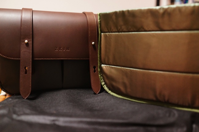
The bag top is made by genuine leather with special finish, but it is still prone to water splash as the stain could be left on the surface. The brand name is embossed at the cover. The rest of the bag is made of grey canvas, which is more durable.

DSC07457

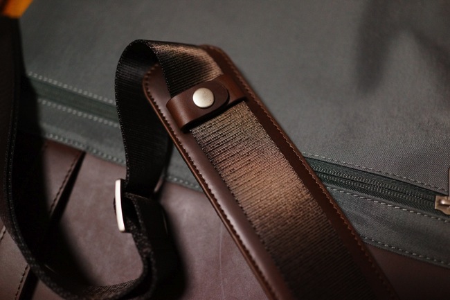
The shoulder pad is detachable, it offers a lot of cushion so that the weight does not hurt the shoulder.

DSC07458

There is a zip pocket at the back of the Champ bag. Even the zip is well designed.

DSC07452

Opening the cover, it is actually attached by a small piece of leather so that the cover does not completely flip over. Therefore the leather is less likely to be worn out.

DSC07453

DSC07455

Inside the bag, it is similar to other camera bags, there is a camera insert to accommodate the cameras and lenses. It can be taken out if you want to use the bag as a normal bag. The Velcro partition can be easily adjusted as well. 

DSC07461

After the insert is taken out, there is one compartment for laptop or other documents. 

DSC07463

My NEX-5N and lenses can be nicely snugged into the bag, while still having some rooms for small accessories and other stuff such as wallet and notebooks. I would say it is most suitable for mirror-less cameras. If you want to use the bag for for DSLR, it may fit up to one camera body and two lenses.

XTJ 5039 TJ

This ZKIN Champ bag in action!

In all, ZKIN Champ bag is of excellent built quality, which is not any inferior to the classic camera brand, Billingham. If you are in the market for a good-looking camera with decent functionality, ZKIN could be one of them on your list. 

Technorati Tags: , , ,

Tuesday, May 7, 2013

Alibaba and Sina: Join Hands for A Better Future

001ec949c22b12e967fa01

(Photo from China.org.cn)

The biggest news last week in China’s Internet industry is Alibaba’s decision to purchase 18 percent of the share from Sina Weibo, by far the largest social network platform in China.

Alibaba is the biggest e-commerce company in China, which most people know it through the much popular B2C platform Taobao.com. Alibaba's business has been growing in an incredible pace for the past few years. Owning the stake in Weibo.com definitely strengthens Alibaba’s strategy in online advertising and sales.

On the other side, Weibo, pretty much the Chinese version of Twitter, has more than 500 million registered users. This massive user base is something that every business would like to tap on.

While Weibo is still prospering, Sina’s share price has been going low for the past few months before Alibaba’s announcement. Weibo has made 66 million dollars in revenue last year, however, the expense is greater, 93 millions, which leads to a net loss of around 27 million dollars. This shows that, just like Twitter, Sina is still struggling to find a profitable business model for its microblog platform.

The alliance between Alibaba and Weibo looks promising for both parties. By leveraging on the large user population, Alibaba’s marketing and advertising could better target the audience and educate more users in online shopping experience. In turn, Weibo could boost its revenue in advertising and maintain a long-term relationship with the e-commerce giant in China. 

From another perspective, Weibo's prosperity is still very much under government's surveillance. Though it may not  be directly affecting its advertising initiative, less free participation from users could still impact the effectiveness of the marketing strategies. That's something Alibaba and Weibo should deal with.

It is a very much promising partnership and collaboration for both Alibaba and Weibo, however, the future down the road still needs both parties' careful planning and steering.

Technorati Tags: , , , ,

Sunday, May 5, 2013

HTC One: BlinkFeed, User Interface, Zoe Photo and Many More!

DSC07412

HTC One has created quite some hype on the Internet because it is first of its kind in HTC's smartphone history. All I want to say is, I love the design of this phone! It is as good as iPhone's hardware design, if not superior. In this post, its focus is on the user experience of HTC One. 

Upon launching the phone, the first thing you would notice is the BlinkFeed. If you have used Flipboard board before, you can imagine how it looks like. It can be customized so that the information and updates you want to see will populate on the home screen. It can be news, like straits times or ESPN, apps such as Facebook and Twitter, and even Calendar items in the phone. In short, it's a one-stop information centre on the phone screen.

DSC07440

HTC Sense UI 5.0 is something I'd like to mention as well. Among all the Android UIs I have used, I like HTC's Sense the best. It is simple, clear and easy to navigate around. The settings are intuitive. In the app menu screen, instead of navigating the apps by swiping left or right, it's up and down. However, the screen can't stay at any random position, it is still displaying the apps page by page. 

DSC07441

The task manager screen is a bit different from other Android phones, much like a mini 'mission control' on Mac.

2013 05 05 21 18 26

The font is sharp and layout is clear. 

2013 05 05 21 18 53

The built-in weather app is awesome.

2013 05 05 11 35 19

Even Play Store is customized to HTC style.

Thanks to 2GB RAM and Quad-core 1.7GHz CPU, it is pretty smooth navigating across the screens and very responsive when launching the apps. It supports LTE connection so download speed is not a problem. But I found the Chinese input in HTC One is not very user-friendly and even troublesome. Luckily I can download 3rd party's input from the Play Store.

The sound quality of HTC is impressive, too. With the dual frontal stereo speakers, and built-in beats amplifiers, the phone delivers much richer sound. It is perfect for playing the music or watching movies.

The biggest attraction is HTC One's camera. Unlike the usual marketing campaign, this time the focus is not on the number of megapixels. Interestingly, it's the opposite. HTC One's UltraPixel camera resolution is only 4 megapixel, but the pixel size is as three times as those 13MP phone camera. What does this mean? It means that it captures 300% more light. The largest aperture of 2.0 and built-in optical image stabalization make it more capable in low light situation. 

2013 04 27 23 21 01 1

2013 04 27 12 30 16

2013 04 24 22 25 21

From the sample images above, indeed HTC One does a decent job in low light, however, because of its relative low resolution, image quality and details are somewhat compromised.

However, that is not the best part about HTC One's camera yet. Its best feature is Zoe. It works like as if you were taking a video, but in fact it is just a continuous stream of pictures with 4 second interval. You can stop at any point to choose the best shot it has got. Also, in each event folder, there is a video highlight that puts together all the Zoe and normal photos in one clip of 30 seconds. Some sample videos are below.

It is definitely a lot of fun shooting the Zoe photo/Videos and it makes the gallery more lively! However, one thing I don't like is that the video highlights is only auto-generated based on the photos and videos under the same event. Moving the photos and videos is not so easy that I could not edit on the best videos I have. 

Battery wise, it is more power efficient than my iPhone 5, at least it could last about a day with the Power Saver mode on. However, I notice that charging the phone through USB port powered by my laptop is extremely slow, which is not the case for my iPhone 5. Charging speed seems improving when I used the socket charger, but still it is not something as fast as I'd expect. 

Verdict

HTC One is something I would recommend my family or friends to have because it has unique metallic design, very intuitive user interface, fast performance and a lot of fun elements with its BlinkFee and Zoe photos. The downside is that the built Chinese input isn't that great, the photo quality is compromised due to lower resolution and slow charging speed. If you are now looking for a new Android phone, this is definitely the one you should at least consider. 

Technorati Tags: , , ,